Balancing Looks and Conversions: How to Build a Website That Does Both
The best websites look sharp but never sacrifice clarity, proving that style and conversion can work hand in hand.
TL;DR: The best websites look sharp but never sacrifice clarity, proving that style and conversion can work hand in hand.
Every founder wants a cool, good-looking website. A modern layout, bold visuals, and stylish typography can make a business feel credible and professional. At the same time, a website exists to convert visitors into leads, signups, or customers. When style gets in the way of substance, the site becomes art instead of a growth engine. The challenge is finding a balance where your site both looks great and performs. This balance is possible, but it requires making conscious choices about priorities and tradeoffs.
The Risk of Prioritizing Style Over Substance
It is tempting to push design first. Sleek animations, oversized photos, and clever layouts may impress your peers or win awards, but they can also bury value propositions and calls to action. A homepage that takes ten seconds to load because of heavy graphics will lose visitors before they ever read your pitch. A navigation menu with hidden options might look clean, but if users cannot find pricing, conversions drop. Design is powerful, but design without usability becomes decoration instead of direction.
The Other Extreme: Conversion at All Costs
On the flip side, some founders strip their site of all personality in the pursuit of pure conversion. They load the homepage with aggressive buttons, endless popups, and heavy tracking. The result feels pushy and transactional, which erodes trust. Conversion optimization is not about squeezing every last click out of visitors at the expense of brand experience. A bland or hostile site may generate short term results but risks damaging long term credibility and customer loyalty.
The Sweet Spot: Marrying Aesthetics With Function
The goal is not to choose between a beautiful site and a functional one. It is to build a site where beauty serves function. Strong visuals can highlight the product, reinforce credibility, and guide attention toward the right actions. Clean typography can make copy more scannable. Thoughtful colors can make calls to action stand out. The key is discipline. Every design choice must support clarity and conversion, not distract from it. A cool looking site is valuable only if it makes people want to engage and buy.
Practical Tradeoffs to Consider
Founders face real tradeoffs when balancing design and conversion. Large hero images look striking, but they must load quickly and include clear messaging. Complex animations can add flair, but if they slow the page or hide key content, they should be simplified. Minimalist menus look sleek, but they must still allow easy access to pricing, contact information, and product details. Each tradeoff comes down to one question: does this design choice help or hinder the path to action? If it helps, keep it. If it hinders, change it.
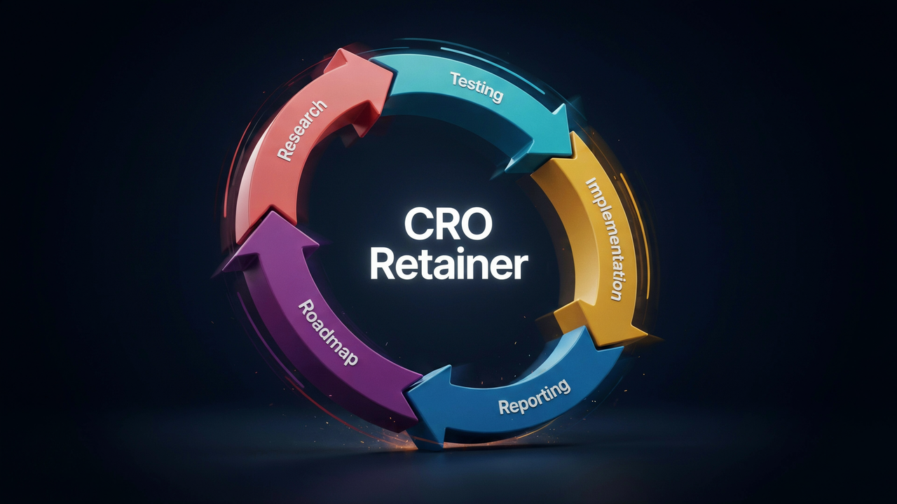
Building a Process That Keeps Both in Check
The safest way to balance style and conversion is to treat your website as a living system rather than a finished project. Start with a simple, clear design that communicates value. Add design flourishes only if they serve the user journey. Test regularly, not only for conversion rates but also for user satisfaction. Pair analytics with feedback to learn if your site is both effective and enjoyable. Over time, this approach produces a site that feels modern without sacrificing performance.
Final Thought: Beauty With Purpose
A website should reflect your brand and impress visitors, but it should also drive results. The balance comes when you let style amplify clarity, not obscure it. Tradeoffs will always exist, but conscious choices backed by testing can ensure your site is both cool looking and conversion friendly. Growth comes from beauty with purpose.
Answers to Frequently Asked Questions
The best websites look sharp but never sacrifice clarity, proving that style and conversion can work hand in hand.
About Author
.avif)