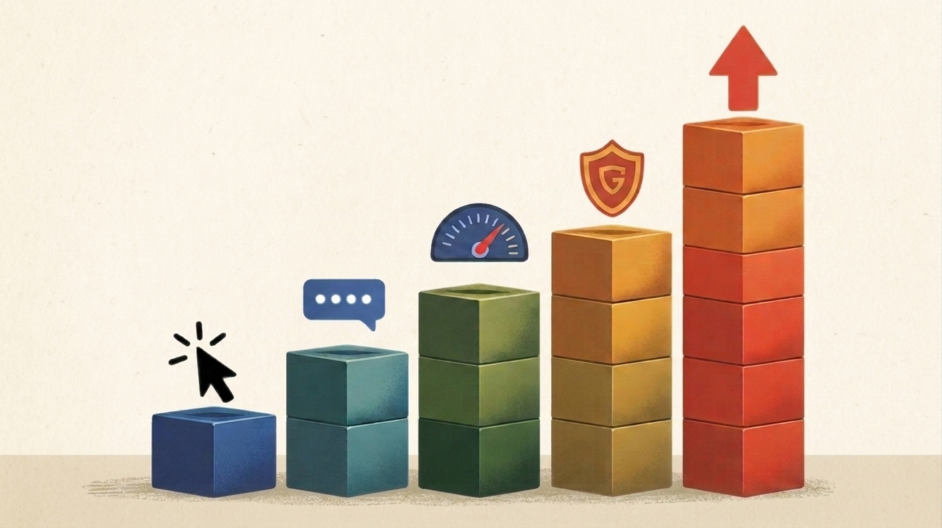
More Than a Pretty Picture: 5 Conversion Optimization Tips for Your Homepage
A homepage that converts balances clean design with clear direction, making it more than just a pretty picture.
TL;DR: A homepage that converts balances clean design with clear direction, making it more than just a pretty picture.
Your homepage is a minefield for conversion optimization. Everyone wants a big, beautiful image, even if this means giving up sales. It's the digital equivalent of your storefront window, and just like a cluttered or confusing display can push people away, a homepage that prioritizes form over function can quietly kill conversions. A beautiful site that does not drive action is simply decoration.
Conversion optimization is about balancing aesthetics with results. Below are five practical tips to make sure your homepage works as hard as it looks.
1. Keep Images in Service of the Sale
Large hero graphics may look impressive, but they often slow load times and bury your most important calls to action. Visitors should never have to scroll through oversized photos before they understand what you offer. Use visuals strategically to highlight your product or service, not to overwhelm it. Every image should support a sales point, not obscure it. A smaller, faster image paired with a clear headline will outperform a massive banner that only looks good in a design review.
2. Make Your Value Proposition Impossible to Miss
If someone lands on your homepage, they should know within five seconds what you sell, who it is for, and why it matters. Too many founders bury this under clever taglines or abstract design. Place a simple, direct value proposition at the top of the page where it cannot be missed. Use customer language rather than internal jargon. If your grandma could explain your product after reading it, you have nailed it. Clarity builds trust, and trust builds conversions.
3. Design for Scannability
People do not read websites like books. They scan for headlines, subheads, and key details. A homepage that looks like a wall of text will lose visitors fast. Break up content with short paragraphs, bold headings, and bullet lists. Use white space to guide the eye. Think of your homepage as a series of signposts leading someone toward the next step. Scannability reduces cognitive load, which means fewer opportunities for a potential customer to bounce.
4. Prioritize Calls to Action
A homepage without clear calls to action is like a store without a checkout counter. Visitors should always know what to do next. Place prominent buttons above the fold, mid page, and at the bottom so no matter where someone stops scrolling, a next step is visible. Use action-oriented language like “Get Started” or “Shop Now” rather than vague phrases like “Learn More.” CTAs should stand out visually without clashing with the rest of the design. A clear, repeated CTA increases the chances of a click at every stage.
5. Build Credibility With Social Proof
First time visitors may be skeptical. Social proof helps tip the balance in your favor. Add a testimonial near the main CTA, display customer logos, or highlight a key review statistic. Even one strong quote in the right place can make a difference. Place social proof close to decision points, not hidden on a separate testimonials page. The goal is to reassure visitors exactly when they are considering taking action.
Final Thought: Beauty Must Serve the Bottom Line
A homepage should absolutely look good, but design should always serve clarity, trust, and action. Oversized graphics, vague headlines, and weak calls to action make a site pretty but unprofitable. By pairing clean visuals with clear messaging, strategic CTAs, and timely social proof, you create a homepage that not only looks polished but also drives measurable growth.
Answers to Frequently Asked Questions
A homepage that converts balances clean design with clear direction, making it more than just a pretty picture.
About Author
.avif)