How One Homepage Change (and Thousands of Surveys) Boosted Conversions by 33%
See how Figgy Play boosted conversions by 33.67% with one headline change, using insights from 20,000+ customer surveys and UX-focused design.

Intro
Figgy Play is a Wisconsin-based retailer of exceptionally high-quality play furniture (mostly) for kids. Figgy came to us with a devoted fan base, top-echelon press coverage, impressive safety awards, and best-in-class fabrication specs, inspired by the co-founder’s time sourcing fabric and materials for hundreds of thousands airline employees.
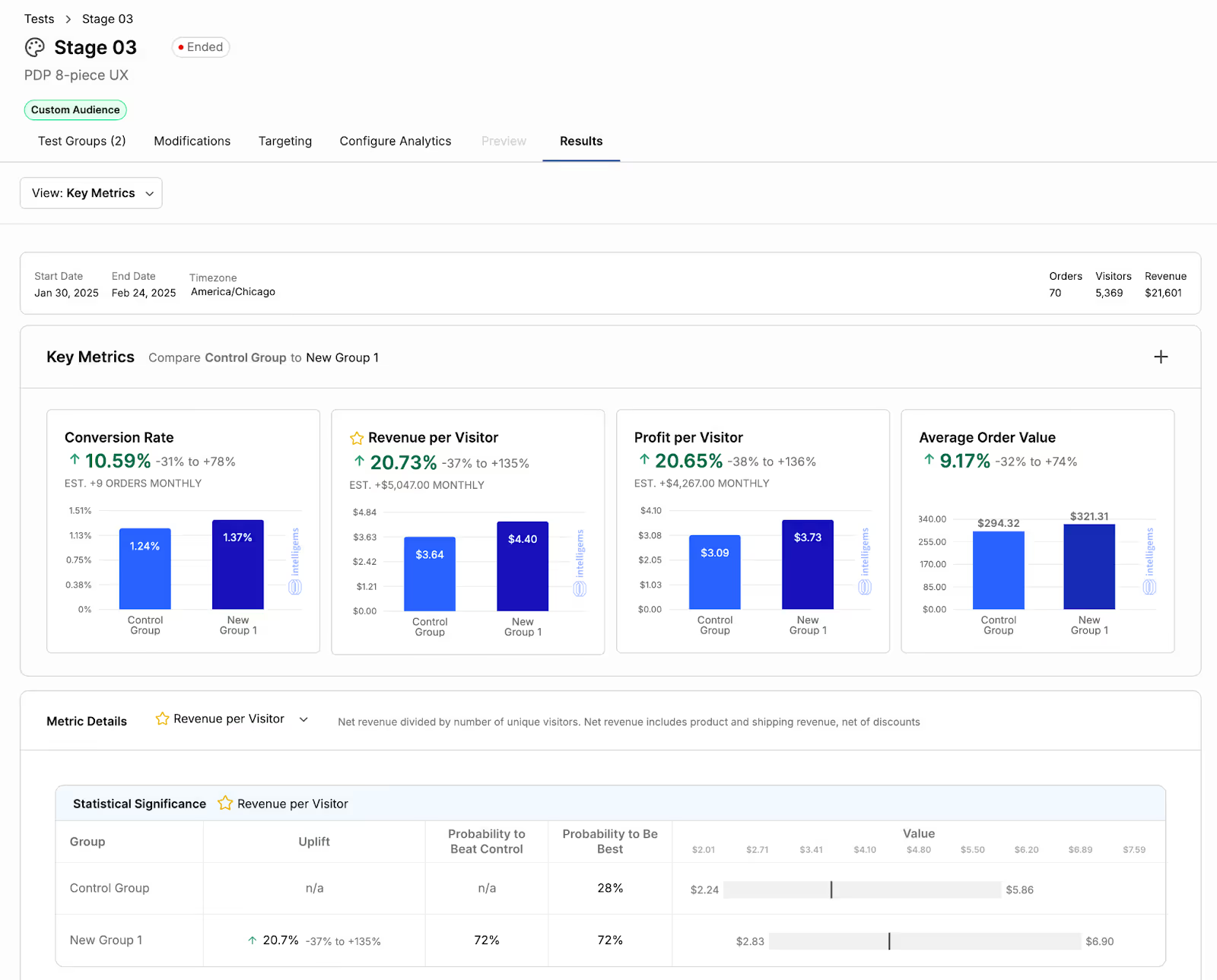
Our initial mission was to increase average order value by adding more product variation and motivational language on their PDP — resulting in a 10.59% increase in conversion rate and 20.73% increase in revenue per visitor. (See here for more details on how we accomplished this.)

We then met with Figgy’s leadership to determine where we wanted to go next.
The Brief
Figgy (the brand) is literally synonymous with its most famous product: The Figgy (the play couch). Therein lay the problem: Buyers would come to Figgy’s website, purchase a Figgy, and disappear, without investigating other products. Even worse: They wouldn’t come back.
Our challenge was to increase purchase frequency and customer lifetime value along with average order value, with a sharpened focus on multiple products per order.
The Research Method
To better understand our situation, we prioritized direct customer feedback from previous purchasers, followed by A/B testing to validate our hypothesis. In collaboration with the marketing firm Point Blank, we were able to survey more than 20,000 people who had either (a) purchased a Figgy within the previous 6 to 12 months or (b) engaged with their email campaign during the previous 30-60 days. We aimed for a survey response goal of .5-2%.
Questions we asked included:
- How were they using their Figgy?
- What would they miss most if they could no longer use it?
- What daily problems did it solve?
- What could make them use their Figgys more often?
- What could make them purchase again from Figgy?
- Which emotions did their purchase trigger?
We knew that by better understanding and contending with these emotions, we could communicate more effectively with new visitors.
The Hypothesis
Thanks to an aggressive incentive offer — $10 off their next purchase, with no minimum order — our survey earned a response rate of .5%, along with a wealth of information. What we found was a semantic gap: Customers actually wanted exactly what Figgy was offering, but the two parties were speaking different languages. Respondents wanted to expand their Figgys with additional products: “Expansion Packs” to make their builds bigger, or to offer additional pillows and covers.
Of course, Figgy already offered those products — but it didn’t call them Expansion Packs. Figgy offered Add-ons. They make perfect sense: When you buy a Figgy play couch, you get the option to add on to it, with additional pillows to expand your set-up. The problem, however, was that no one was looking for Add-ons. They were looking for Expansion Packs.
The survey also helped us better understand buyers’ emotional landscapes. Figgy had gone to great lengths to communicate the sturdiness and high quality of its foam — but this is a feature, and it didn’t reflect how buyers experienced it. Instead, they viewed the foam in emotional terms: They described its quality in detail — it was good enough, in fact, that parents could stow one next to a sick child’s bed, allowing them to rest while staying as close as possible to their kid. This told a much bigger story about how Figgys were transforming their customers’ lives.
That survey provided insights we could use into the next decade. The most important lesson was to build on those product specs to tell the bigger, better, truer story of Figgy and how it emotionally impacted those who brought one into their homes.
The Strategy
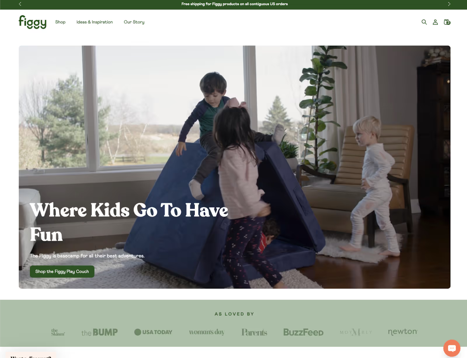
We took a fresh look at Figgy’s homepage.

"ConversionFlow developed and executed a thoughtful A/B testing plan that took our conversion rate from 0.8% to 1.3% in under a year—a huge win for us. That kind of impact effectively doubled the value of our marketing efforts. On top of their results, the team feels like family—fun, easy to work with, and always going above and beyond. I'd recommend them to anyone looking to break out of the ad spend spiral and start seeing real growth."

Overall, the homepage was not ineffective, and it did what it was designed to do, which was to move people deeper into the conversion funnel.
We wanted to build on that success — while also priming visitors to better understand the Figgy’s true value, rather than just the product’s features.
They were doing a great job at the latter. Expanding on the former, though, was tricky: The real benefits of buying a Figgy are complex and difficult to communicate, unless you’re keyed into news around clinical trials examining how detrimental screens are for young minds, and how free play and complex movement can set children up for healthier and happier lives, with increased emotional regulation, better cognitive development, and more. We wanted to help parents understand that success in the wider world began on a Figgy.
But how to approach this? We wanted a headline that would snap people out of browse mode and help them realize that a Figgy wasn’t a toy — it was a tool, carefully designed to help their children become the leaders of tomorrow.
After multiple rounds of iteration, we delivered a powerful revision:
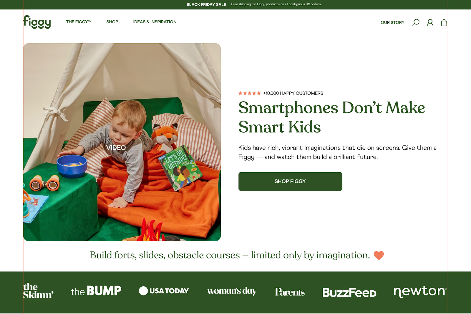
Smartphones don’t make smart kids: Kids have rich, vibrant imaginations that die on screens. Give them a Figgy — and watch them build a brilliant future.
The Figgy was positioned as it should have been: not valuable because of its physical build but because of what it could do for kids, respecting and surfacing all of the emotions parents experienced — pride, hope, fear, anxiety — as they did their best to help their children succeed.
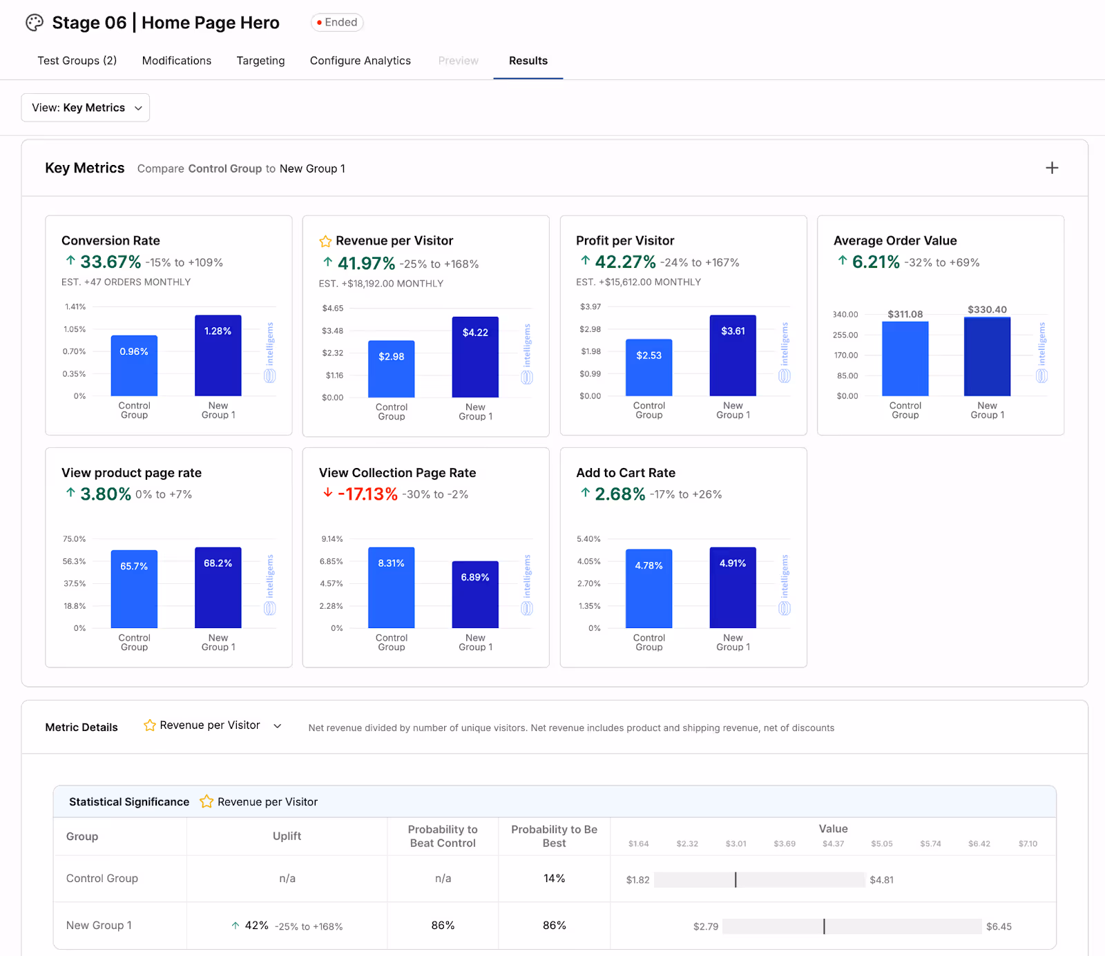
The Results
Following these changes, Figgy saw:
- A boost in conversion rate of 33.67%
- Revenue per visitor up by 41.97%
- Profit per visitor up by 42.27%
- And AOV up by 6.21%