The Shopify CRO Audit: What to Look For, What to Fix, and What Most Brands Miss
A real Shopify CRO audit goes far beyond speed scores and button colors. It's a systematic review of every friction point between a visitor and a purchase. This post covers the eight areas that matter most, including the one step most audits skip entirely.
TL;DR: A real Shopify CRO audit goes far beyond speed scores and button colors. It's a systematic review of every friction point between a visitor and a purchase. This post covers the eight areas that matter most, including the one step most audits skip entirely.
Most Shopify store owners think they have a traffic problem. They don't. They have a conversion problem they've been calling a traffic problem.
You can pour money into Meta ads, build TikTok content until your eyes cross, and still watch your revenue flatline. None of that matters if the store itself is leaking. Every unoptimized page, every confusing navigation label, every millisecond of unnecessary load time is a visitor who came in the front door and left through the back without buying.
A CRO audit is how you find those leaks. Not by guessing. By systematically examining your store through the eyes of a skeptical, impatient, phone-scrolling customer who has approximately zero loyalty to you yet.
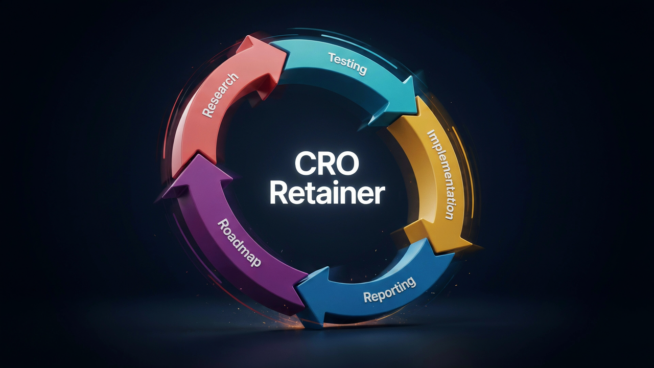
Done right, a Shopify CRO audit doesn't just find problems. It tells you exactly where to focus, in what order, and why, so your next optimization effort compounds instead of scatters.
What a Real CRO Audit Actually Covers
A real CRO audit is not a tool report. Running Google PageSpeed Insights and calling it an audit is like checking your tire pressure and calling it a car inspection. Tools are part of it. But the audit also covers copywriting, trust signals, user psychology, and the language you're using to talk to your customers. Here's what we look at when ConversionFlow audits a Shopify store.
1. Site Speed & Core Web Vitals (The Silent Conversion Killer)
Speed is not a technical concern. It's a revenue concern.
A one-second delay in page load time drops conversions by 7%. That's not a rounding error. It's a material hit to your business, happening quietly every single day. Most store owners have no idea their site is bleeding this way because the site still works. It just works slowly.
The three Core Web Vitals benchmarks that matter:
- LCP (Largest Contentful Paint): Under 2.5 seconds. If it's slow, people bounce before they see what you sell.
- CLS (Cumulative Layout Shift): Under 0.1. The page shouldn't jump around as elements load. Layout shift destroys trust instantly.
- INP (Interaction to Next Paint): Under 200ms. Lag here makes your store feel broken.
On Shopify, the most common speed killers are uncompressed images, app bloat, and theme code layered over for years without cleanup. Every app you install adds JavaScript to every page load, whether you're actively using it or not.
In our experience, stores often lose 15 to 20 percent of their conversions from unoptimized images and excess app scripts alone. Most fixable problem we encounter. Most ignored.
Tools: Google PageSpeed Insights and GTmetrix. Test mobile and desktop. Then review your app list: when did you last actually use each one?
If your mobile speed score is below 50, stop everything else. This is your first fix.
2. Homepage Clarity (You Have 5 Seconds)
Five seconds. That's the window.
A new visitor lands on your homepage and asks three questions, whether they realize it or not. What is this? Who is it for? Why should I care? If your homepage can't answer all three in five seconds, you've lost them.
A few specific things to look for:
Value proposition: "Premium outdoor gear" is a value proposition. "Shop our collection" is not. Specific beats generic every time. The hero copy should tell someone why this store over the ten others they could find in thirty seconds.
Hero image: A product on a white background tells a customer almost nothing. A product being used by a real person in context tells them everything. Lifestyle imagery consistently outperforms studio shots for DTC brands.
Navigation: More than five to seven top-level items and you've crossed into confusion. Mega menus tend to overwhelm on Shopify. The paradox of choice is real.
In our experience at ConversionFlow, homepage clarity issues show up in roughly 80 percent of initial audits. It's almost never a design problem. It's a messaging problem.
If a stranger can't explain your store back to you after five seconds, fix the copy before you touch anything else.
3. Product Detail Pages (This Is Where Revenue Is Won or Lost)
If the homepage is where trust begins, the product detail page is where the purchase decision is made. Give this section serious attention.
Above the fold: Before a customer scrolls a single pixel, they need to see: the product name, price, a primary benefit statement, social proof count and rating, and an add-to-cart button. All of it. If any of these are buried below the fold, you are losing sales right now.
Product images: The minimum is four to six angles. Lifestyle shots showing the product in context outperform studio photography because they answer an implicit question: what does this look like in my life?
Copy: Most Shopify product descriptions read like spec sheets. "3000mAh battery" is a feature. "Charges your phone twice on a single charge" is a benefit. The translation matters more than the spec.
Social proof placement: Reviews should appear near the buy button, not buried at the bottom of the page. Proximity to the CTA increases the influence of social proof.
Sticky add-to-cart on mobile: Mobile accounts for over 70 percent of Shopify traffic. A sticky add-to-cart bar is not a nice-to-have. It's a default expectation.
We saw this directly with Cute.Camera. After rethinking the full PDP experience, including layout, image strategy, and a sticky cart on mobile, add-to-cart rates increased by 15 percent. No new traffic. No ad spend. The same visitors, converting better because the page finally worked the way a customer thinks.
The PDP is not a page. It's a sales process. Build it like one.
4. Checkout Flow (The Last Place You Want Friction)
Shopify's native checkout is genuinely strong. The audit here is about what surrounds it.
According to Baymard Institute research, the average cart abandonment rate is approximately 70 percent. Most of that abandonment is preventable. It happens because of friction you introduced without realizing it.
Guest checkout: Forcing account creation before buying is one of the most documented conversion killers in ecommerce. Let people buy. Invite them to create an account after, once they've decided to trust you.
Progress indicators: Tell shoppers where they are in the process. The unknown creates anxiety. The known creates momentum.
Trust signals at checkout: SSL badges, accepted payment icons, and a guarantee reminder at the payment field address the question every first-time buyer is asking: is it safe to give this site my card?
Form field reduction: Every field you add is a reason someone might abandon. If you don't need it to complete the order, remove it. "How did you hear about us?" does not belong in checkout.
Zero surprises, zero unnecessary asks, maximum confidence. That's the standard.
5. Mobile Experience (Not Mobile-Friendly, Mobile-First)
Most Shopify stores are designed on a laptop and approved on a laptop. Then 70 percent of the people who visit are on their phones.
"Mobile-friendly" is table stakes. The real audit question is whether your mobile experience converts as close to desktop as possible. Most stores have a 30 to 50 percent gap. That's not a traffic problem. It's an optimization problem.
What to check:
- Tap targets: Minimum 44x44 pixels. Anything smaller and mobile users are mis-tapping, getting frustrated, and leaving.
- Font size: Body copy below 16px forces users to zoom in. If they have to zoom to read your product description, the experience is already broken.
- CTA buttons: Full-width on mobile. Not narrow, centered buttons that look good on desktop. Full-width, thumb-friendly, impossible to miss.
- Image load on LTE: Test on a cellular connection, not just WiFi. What loads in two seconds on WiFi can take six seconds on LTE.
Go through your entire mobile flow as a shopper would, from a cold ad click through to checkout. Do it on your actual phone, not a browser simulator. You will find problems.
6. Navigation & Site Search (The Overlooked Conversion Lever)
Here's a number worth sitting with: visitors who use site search convert at two to three times the rate of those who don't. They are telling you exactly what they want. Your job is to help them find it fast.
If your search bar is a small icon hidden in the corner, you're burying your best conversion tool.
Site search basics: Is it visible on both desktop and mobile? Does it have autocomplete? What happens when a search returns zero results? A dead-end zero-results page is a conversion killer.
Navigation structure: Your nav should be organized around how customers think, not how your inventory is organized. Build categories around customer intent, not SKU hierarchy.
Filters on collection pages: Faceted search is dramatically underutilized on Shopify. If you have more than twenty products in a collection, robust filtering is not optional. It's the difference between finding what you want and giving up.
Every additional second a customer spends hunting is a second they're considering leaving. Good navigation removes the hunt entirely.
7. Trust & Social Proof (The Silent Objection Handler)
Every visitor carries unspoken objections. Is this brand legit? Will the product actually work? What if I need to return it? Your job is to answer every one of those questions before they're asked.
Reviews: Aim for a minimum of ten reviews per product, surfaced near the add-to-cart button. Reviews are the closest thing to a friend's recommendation at scale. Placement matters as much as quantity.
Trust badges: Payment icons, SSL indicator, return policy callout. These need to appear at the moment of purchase decision, not just in the footer where no one sees them.
About page: Faceless brands convert poorly. Real people, real story, real mission. If your About page is three sentences and a stock photo, it's working against you.
Trust isn't something you bolt on at the end. It runs through every layer of the funnel, in your copy, your images, and whether your contact information is easy to find. ConversionFlow treats it as infrastructure, not decoration.
8. Voice of Customer Alignment (The One Step Most Audits Skip)
This is the section that separates a real CRO audit from a tool-based checklist.
Most tools can flag a slow page or a missing trust badge. What they cannot tell you is whether the words on your site are the right words, the ones your actual customers use to describe their problems, their desires, and why they bought.
Here's the test: pull your twenty most recent reviews. Now look at your homepage headline and product copy. Are they using the same words? The same phrases?
Usually, they're not. The copy was written by a founder guessing at what sounds right. The reviews were written by a customer describing their actual experience. That gap costs conversions.
This is Voice of Customer alignment, and it's one of ConversionFlow's core audit steps.
The Figgy case study is the clearest example we have. Their product page called a category "Add-Ons." Customers kept calling the same products "Expansion Packs." One language change drove a 33 percent conversion boost. Not a redesign. Not a speed fix. One word.
If your copy was written in a conference room without a customer present, it probably needs a rewrite. The source material is already there, in your reviews, support tickets, and emails. You just have to use it.
Where your customers' language appears on the page matters as much as anything technical in this audit.
Final Thought: An Audit Without Action Is Just a List
A Shopify CRO audit is not a deliverable. It's a starting point.
The stores that see real results are the ones that use the audit to build a prioritized action plan, not a 47-item to-do list sitting in a Google Doc. A clear sequence of high-impact changes, tested and measured.
Start with speed. Fix your PDP hierarchy. Test your mobile flow. Then work through the rest, in order of impact.
The difference between a store converting at 1.8 percent and one converting at 3.5 percent is rarely one big thing. It's a hundred small things, done deliberately, over time. A real audit shows you exactly what those things are and where to start.
Want a professional eye on your Shopify store? Book a free strategy session with ConversionFlow.
Answers to Frequently Asked Questions
A real Shopify CRO audit goes far beyond speed scores and button colors. It's a systematic review of every friction point between a visitor and a purchase. This post covers the eight areas that matter most, including the one step most audits skip entirely.
About Author
.avif)